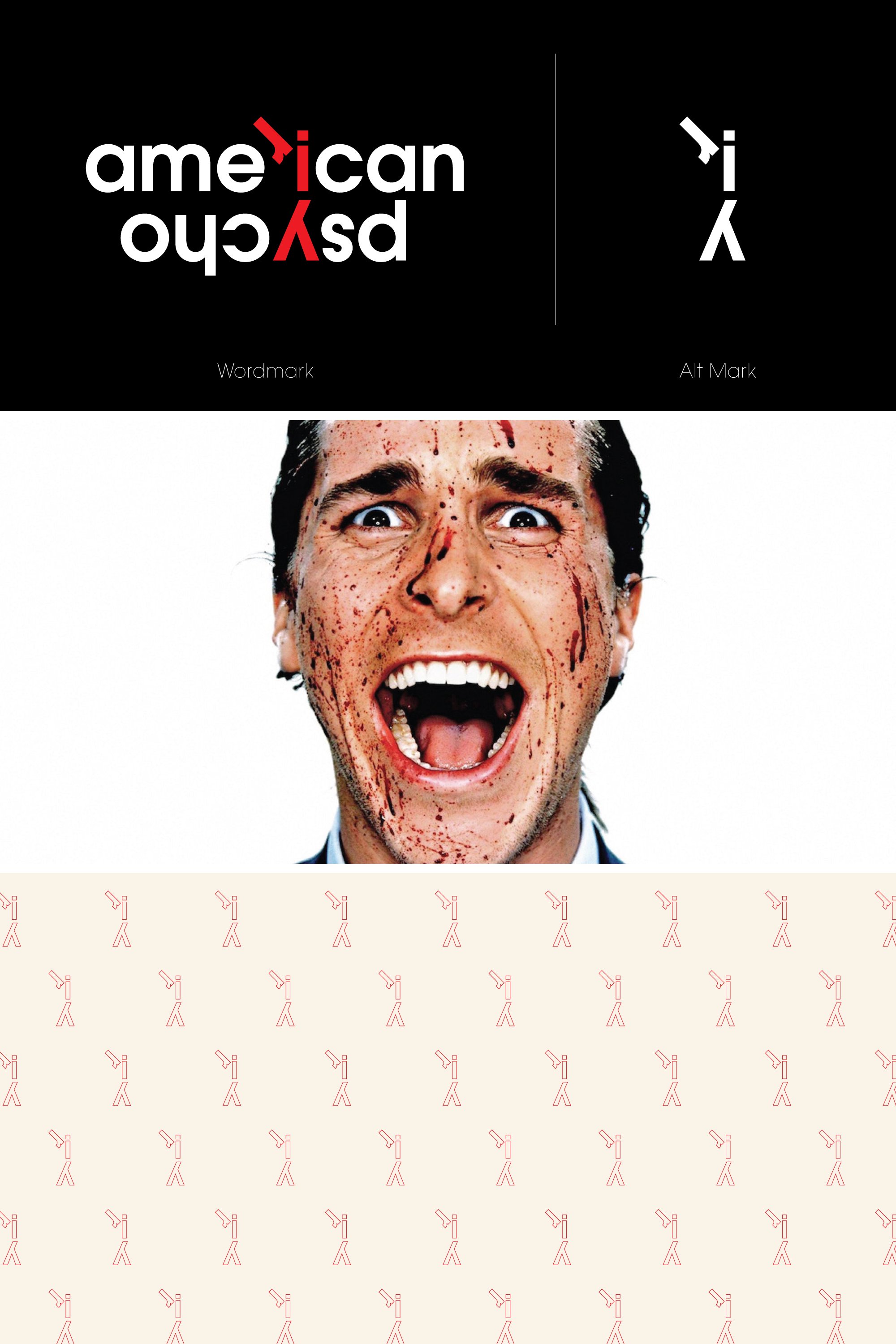
American Psycho
A typographical exercise that transitioned into a branding project for the film, American Psycho. The goal was to take the title of the film and create a mark solely based on the type. Given that the character has a split personality, the concept was to illustrate a very clean, yet shocking flip of the switch from something clean and simple, to very drastic and dark.
![American-Psycho-01.jpg](https://images.squarespace-cdn.com/content/v1/62813a268ff18c238425170d/01a21b2b-c05e-48d3-aca4-9c81fa5422f2/American-Psycho-01.jpg)
![American-Psycho-03.jpg](https://images.squarespace-cdn.com/content/v1/62813a268ff18c238425170d/b4589a5a-9f55-49a7-ab3d-435652c93c56/American-Psycho-03.jpg)
![American-Psycho-04.jpg](https://images.squarespace-cdn.com/content/v1/62813a268ff18c238425170d/0ff18cec-f271-4696-964e-6071851406f1/American-Psycho-04.jpg)
![American-Psycho-02.jpg](https://images.squarespace-cdn.com/content/v1/62813a268ff18c238425170d/63bbfb17-f45f-4e88-9656-e5ba4a309266/American-Psycho-02.jpg)